Our experience working with a local web development company in Poole
How we built a website that actually brings in new swimmers.
Our experience working with a local web development company in Poole
How we built a website that actually brings in new swimmers.
Published: 30 March 2026
How we built a website that actually brings in new swimmers and enquiries
When we first launched Bluefins Swimming, we knew how strong our offering was.
Great coaching. Small group lessons. A proper focus on helping kids build confidence in the water.
But our website didn’t reflect that.
It looked fine on the surface, but it wasn’t really doing its job. People would visit the site, have a quick look around, and then drop off without getting in touch.
We realised pretty quickly that if we wanted to grow, we needed something better.
Why we decided to redesign our website
Like most small businesses, we initially thought a website just needed to “look nice.”
But what we actually needed was something that would:
Clearly explain what we offer
Build trust quickly
And guide people towards booking lessons
Ours wasn’t doing that.
There wasn’t a clear flow, and no real structure helping parents understand what to do next.
That’s when we started looking for a local team who could help.
Working with Greenlights
We ended up working with Greenlights, a local web development company based in Poole.
What stood out straight away was their focus on conversions, not just design.
Rather than jumping straight into colours and layouts, they spent time understanding:
How parents actually choose a swim school
What information they look for first
And what makes them feel confident enough to enquire
That approach made a big difference and this is something they apply across all their web development projects.
If you’re looking for something similar, you can see more about their approach to building conversion-focused websites.
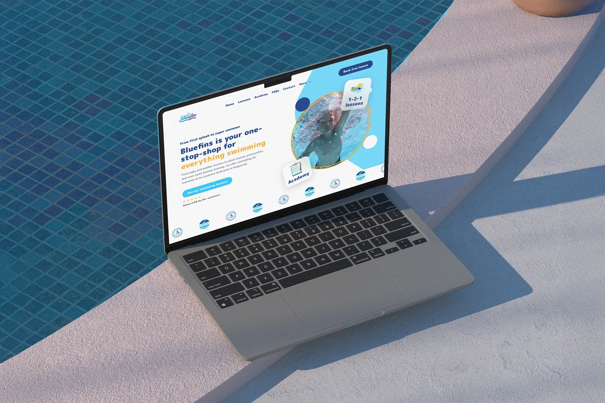
What changed on the new website
The biggest shift wasn’t just how the website looks, but how it works.
Everything now has a clear purpose.
Clear messaging from the start
Instead of trying to say everything at once, the homepage now focuses on the key things parents care about:
Who the lessons are for
What makes them different
And how to get started
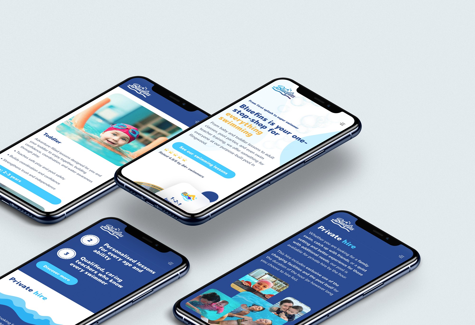
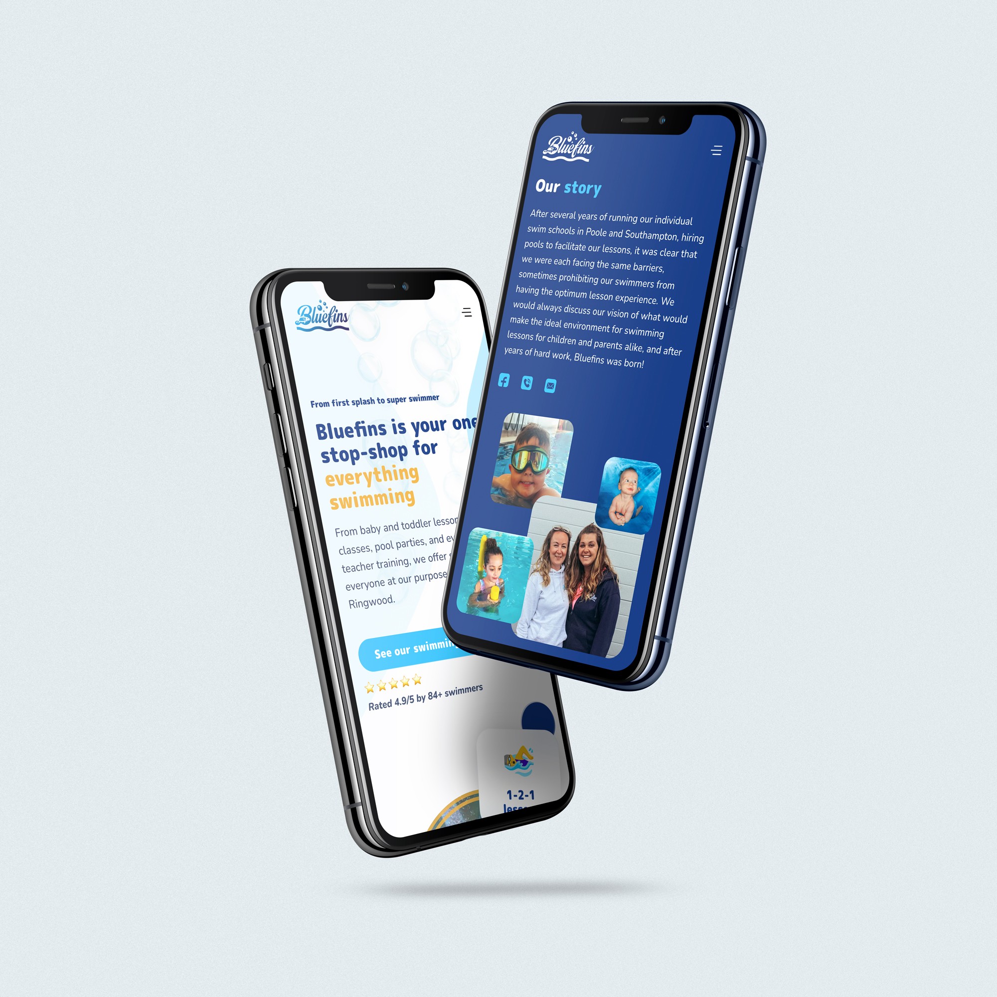
A much simpler structure
Before, visitors had to figure things out themselves.
Now, the journey is straightforward. You land on the site, understand what we offer, and are guided naturally towards making an enquiry.
Mobile-first experience
Most parents are browsing on their phones.
The new site is designed with that in mind, so everything is easy to read, scroll, and interact with on mobile.
The impact so far
Since launching the new website, the difference has been noticeable, something that’s also covered in more detail in the full project breakdown.
We’re seeing:
More enquiries coming through
Better quality enquiries
And people arriving already understanding what we offer
Which makes conversations much easier from the start.
It feels like the website is now actually supporting the business, rather than just sitting there.
Final thoughts
If there’s one thing we’ve learned from this, it’s that a website isn’t just about how it looks.
It’s about how it guides people.
Working with a Poole web development company that understands that made a big difference for us.
If your website isn’t bringing in the results you expected, it might not need a complete overhaul, but it probably does need a clearer structure and a more intentional approach.
For us, making that change has been well worth it.


Our location
Unit 11, Parvaneh Business Park, Embankment Way, Ringwood, Hampshire, BH24 1WL
Call us
Email us

Our location
Unit 11, Parvaneh Business Park, Embankment Way, Ringwood, Hampshire, BH24 1WL